Monday, November 29, 2010

I am struggling once again to just share a few pieces of art that I liked

I think this photographic mural of Barbara Kruger really
says it all for me.  She know how to evoke emotions from us. 
She makes us look at ourselves and our society in a way
that maybe we don't want to.


I know this is 3-D but it was a crazy sculpture.
My five year looks just like this little boy so
I couldn't help bue have an eery feeling.


The lines in this paritcular painting are amazing to me.  It
really feels like a 3-D effect as if the fence is about to
fly over my head.  I can almost smell the air of summer time.
I think it depicts the Holocaust and a freeing feeling of
finally being freed. 


I did not get the information for this one, but I love it.
It was done by wood cuts stamped on mylar.  The artist managed to cut
These artery map like lines that occupy a large wall and attach to the wall.
the patience to do this literally makes my head hurt.

My visit to the Denver Art Museum

I realized I hadn't been to the Art Museum since it had been renovated and it's been about 16+ years.   What an expereince.  I took my 12 year old son and my sister along with me.  We made a whole day of it and really got to see some remarkable and interesting pieces of art.  When I crossed over to the original building it felt like I went back in time.  The musty smell brought back memories of when I was a little girl and we went as a family.  I remember seeing a room full of minatures and  doll house displays.  I was so excited about it because it seemed magical to me and that possibly the minatures would come to life when we weren't looking.  To this day I love minature things.  I have revamped an old doll house and have painted minature furniture and dishes.  I wonder if my son's visit will inspire him to create some art one day?  It is definitely in him and he told me he had no idea that the art museum experience was going to be that cool.  That  made our venture worth it to me.


I love this painting because it really captures the pureness
of a child.  My son did not realize it was a painting until I
pointed it out to him.  To look at this painting up close blows me
away of the clarity and beauty of Gottfried Helnwein's work.


Out of all the different pieces of art we looked at this was my son, Kyle's
favorite piece.  I am not sure what to think of it personally. 
The title "Wheat Fields"is a little vague for me. 

Our assignment to work on moving art

I have never used any of the animation tools on the computer before.  Alisha and I partnered up and explored a few areas.  We really had fun on powerpoint.  We found some psychedelic images we liked and found sound effects to go with them as we got them to do some movement in each cell.  We were unable to put it on our log, but the one thing we felt we accomplished was that we were able to put sound to it. 

my own joiner creation

I had so much fun creating this. 
I became very consumed trying to put each photgraph in the correct spot.

I took over 70 snap shots from my upstairs balcony overlooking
my neighborhood.  It may not be David Hockney's work, but
I was so excited to see it come to life. and actually work.

Sunday, November 14, 2010

David Hockney and his Photographic 'Joiner' Works of Art


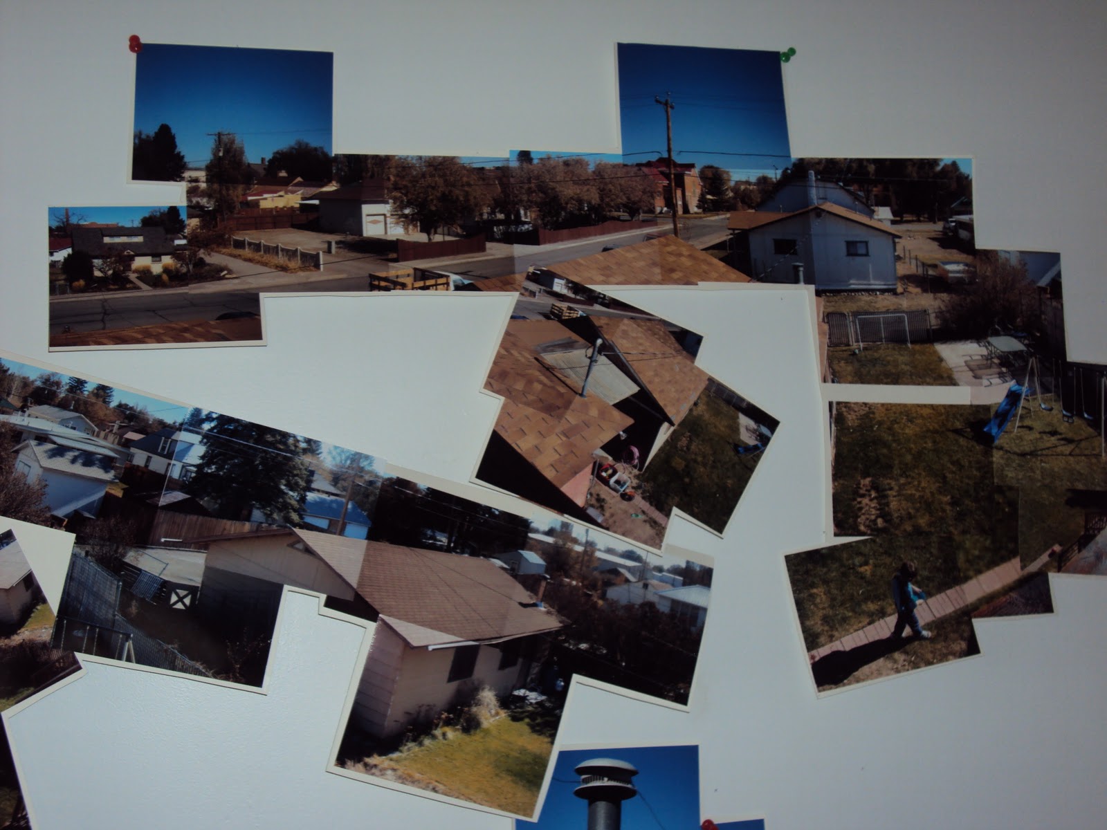
"Photo Montage" David Hockney

"Chair" - David Hockney

"The Desk" 1984 - David Hockney

"Pearl blossom Highway", 11th-18th April 1986
David Hockney

David Hockney
His work is looked at and referred by the Cubism principles as having
 three elements of art which are layered time, space and narrative of which
a single photo cannot have.
I became very intrigued by David Hockney’s work after being exposed to some of his photo collages shown in class.  The assignment of creating our own form of photographic collage became a new interest of mine.  I now catch myself checking out my environment with a new set of eyes of how the visual space presented in front of me would be fun to explore by taking multiple photos of it.  The outcome was so challenging and engaging for me while attempting this feat. I love the subjects that David Hockney used to photograph for his collages.  They were rather simple, but made them more significant when presented in the collage form.
He is a seventy-three year old British artist who has been incredibly influential over the past fifty-plus years.  He was claimed as a pop-artist, but I am not sure he cared for the title.  His main medium is oil paints, yet he has an array of other works done in other mediums such as print making, sketching, photography and presently has fallen in love with the I-pad as his new form of medium.
            Throughout his life he chose subject matters that were personal to him.  He painted many pool scenes, people he knew and other scenic views that were of significance to him.  I enjoyed viewing his different phases of art he created starting from the fifties to the present.  I noticed in several of his pieces, mainly starting from the seventies, was his approach of creating his visual space with grids that would help break up space.  A lot of his pieces are more than one panels joined together such as his painting of “Schwimmbad Mitternacht (Paper Pool II)” 1978.  In the 1980s he really started to focus on his photography as a “concept of naturalism by representing things as they were actually being viewed.” He grew to love this kind of work, but didn’t want to become too dependent on his photographs as an artist.  He created amazing Polaroid collages that had the white frame around them so when pieced together it gave a grid affect to help break up the picture.  He than just took multiple photographs with a regular camera of a subject such as a highway he titled, “Pearl blossom”, a chair, a desk, a telephone pole and many other scenes.  To try and explain the outcome would be hard.  I can only say that his collages make me think of what a fly might be viewing with all of it’s’ eyes on a subject.  It really changes your perspective of what you thought you were looking at and then viewing it with a different set of eyes. 
            I really admire David Hockney, because he still exudes a passion to grow as an artist.  I viewed many works of his and he still produces daily.  He has become completely wrapped up in using the I-pad as his new form medium to create his artwork.  He claims he can create an “I-pad” painting first thing in the morning and send it out to his friends for them to enjoy.  It isn’t so much about the recognition for him now, nor the money, but the mere satisfaction of making others happy by presenting them with some of his art.  He likes the idea of no messes involved and feels that Picasso and Van Gough would have been sold on the whole I-pad concept too.  What a fun man, David Hockney is.  I have enjoyed learning about and observing this man’s work.


Tuesday, October 5, 2010

Katharina Grosse
A Modern Artist from Berlin

            I went online and looked up a few websites and two words that come to mind are “WOW!’ and “Trippy”.  What is going on in her head?  The funny thing is that I like what she produces.  She uses an industrial paint sprayer and expresses herself as kind of a rebel towards “fine art”.  She paints on whatever she wants.  She paints on walls, floors, ceilings, beds, books and natural materials like rocks and dirt.  I really got a sense of emotion with her choice of colors.  Like her “Hello Little Butterfly…” it is bright and cheerful with yellows and purples and blues.  It was like a butterfly got its wings in some paint and was fluttering chaotically to try to get it off, meanwhile it was making beautiful marks all over the walls.  The colors in her work all run/bleed together and really give a sense of movement.  Her choice in colors seems to really evoke emotions.  Somehow she is getting her opinions expressed through the colors she uses.  You can tell if she is mad or if she finds beauty in something. Some of her works give me a feel of a flood of colors rushing into a room, like it is coming right at me and I better move and get out of the way or else I will be colored myself.  Obviously she has an effect on lots of viewers as I noticed she has exhibits all over the place and even at our Denver Art Museum.  Personally, I would love to see her work in person.  I have a feeling seeing pictures online doesn’t quite justify her work.  It may sound silly, but I find her to be a brave artist to be okay to paint all over things as she does.  It is crazy and impulsive to me.  As amateur artist I still feel confined in creating “fine art”.  She really goes outside of the box.   I don’t know that I would ever go her route, but she does give me a sense of freedom to do whatever inspires me.
This is Katharina all decked out creating her art.
This is absolutely breath taking.  This is
the room where it feels like the colors are
flooding/rushing into the room.

Sunday, September 19, 2010

I couldn't just pick 6

I had so much fun exploring with my camera.  I have a new hobby now.  Values can make or break a picture and can really create emotions and give interesting perspectives. However, I chose six of my photographs that I was really pleased with and I numbered them in their caption.

The Power of Value

The vertical lines pull you down.
I love this composition of soft light and
extreme darkness.  You can almost feel the
breeze coming through the curtain.
This sets a mood of tranquility. 
1.
This shadow created a beautiful silhouette.  There
are strong horizontal lines and diaganol lines
that make this compostion work.  Even the contrasting
values make it balanced. 
The outlining is so strong as well as the repetition of rows.
From this angle the diagonol lines change the shape of the the
actual square of the photo givng a feeling of continuance. 
There is a nice blend of grays, whites and blacks.

2.
This composition feels balanced in which  the two focal points
play off one another.  The low-key value in the
background  and the center of the flowers really compliment
the high-value of the petals.
3.
I love the gradation of value and the feel that the dark shadows are endless holes.  There are
also great repetitious lines, both vertical and horizontal. My eyes
start at the light values at the bottom and the move all the way up to the top and curve
to the left into  dark pits of the unknown.
4.
The highlighting brings such a delicacy to this petunia, yet the dark defined
veins that run through it signifies strength to survive in its elements.  the negative space
of dark value really makes the flower stand out as the focal point.
5.
This is a wonderful example of contrast between lights and darks
as well as textures of smooth and rough, yet ,this image gives
me a feeling of balance.  the dark values cover one side and the
light values cover the other side.  There is also a great mixture of
values throughout the photo too.
I felt like a detective when I was playing with the values. I didn't notice while I was taking the picture that there
was a hidden message on the house. I believe is says, "HOME GROWN".
Working with black and white photographs really made me focus on the  details
which I normally wouldn't have noticed necessarily in color
From this angle the horizontal lines go from dark values to light values
from left to right.  There several shifts of directions going on here and the varying
values help guide the eye in movement going from up and down and side to side.

There is a nice balance between low-key and high-key value. I love the
vertical lines that join with the diagonal lines and the dark value space in between
really emphasizes the directions and controls how the eye will look at the composition.

6.
There is a beautiful spiral of repetition between lights and darks.
It looks like a snail's shell. The center of the stairs is highlighted and breaks
away to gradation in values and then goes back into highlights again.


Wednesday, September 8, 2010

Some of Joseph Albers's Artwork

Joseph Albers
"Homage to the Square"


"Homage to the Square"

Joseph Albers

JOSEPH ALBERS


He was an artist originally from Germany who came to America during WWII. At the art school he attended in Bauhaus, Germany he was introduced to the beginnings of “Abstract” Art. He brought his great perspective with him and taught art in North Carolina and then at Yale University.

He has always loved using geometric shapes, lines and color in his art. He used them in such a way in his composition that he could create an illusion of how the picture looked to the eye versus how the art really was done. He was truly the master at understanding colors and knew how to place the correct colors together to give the shapes new direction and meaning. He realized that color influences the composition and can affect the space around the shape. He was able to give his geometric shapes a dimensional look by just figuring out what colors to use together.
Here are a few websites on Joseph Albers.
http://www.washingtonpost.com/wp-dyn/content/gallery/2010/02/19/GA2010021902645.html
http://library.thinkquest.org/J0110336/albers.htm
http://design101.tumblr.com/

Thursday, September 2, 2010

In my 2-D art class we attempted the “conceptual” style of art like Sol LeWitt. We were put into groups and were assigned to come up with a set of written instructions of what we wanted done using colored tape. We could designate a specific wall or let the group choose a wall as well as create instructions for a random outcome or specific outcome. After we wrote out our instructions we exchanged with another group. Each group then had to execute the written instructions that were given to them. It was incredibly fun to try to interpret some other group’s instructions and to also see the results of how another group interpreted out set of instructions. I loved the concept of it being a collaborative effort and it allowed the groups to get to know one another at the beginning of the semester.
This is the "conceptual" art my group
created when we read the instructions
written from another group.
This is another creation done by
a group following another group's set
of instrucitons. The one below is another
example too.
This is the outcome from our written
instructions that another group had to read
and interpret. This is how it was
executed.  It wasn't totally how we
envisioned it yet the outcome was
beautiful.

Saturday, August 28, 2010

Sol LeWitt

This is #541.  Some college students followed Sol's written instrucions and were able to complete his vision.  It was later taken down

http://www.blackbird.vcu.edu/v8n1/gallery/smith_e/lewitt_541.shtml
http://www.metroartwork.com/Sol-Lewitt-biography-artwork-m-118.html

I personally had never heard of Sol Lewitt until this class.  When I initially saw some of his work, I wasn't overly impressed.  I thought to myself, "I could do that". Well, I started to read about him and his work and then I became intrigued.  This man was truly amazing on how he envisioned art. 
This was the certificate of instructions for drawing #541. Each pieceof art came with a certificate of written instructions.
Sol Lewitt was born in 1928 and died fairly recent in 2007.  He really started receiving recognition in the 60's for his "Conceptual" and "minimalist" artwork.  He did both art in 2-D and 3-D.  He considered his 3-D work to be structures, not so much sculptures.  He liked focusing on geometric shapes like cubes.  When it came to the "conceptual" approach to his art, I really became fascinated.  Part of his art process was to have an idea first and then have a systematic plan of instructions so that anyone should be able to execute the idea for the piece of artwork he thought of .   He did around 1100 pieces of wall art.  His intentions, when doing these wall art drawings , were to be instructional, collaborative and temporary.  I really thought this was such a great way to express art.  It was different from what I am used to and I liked the idea that the instructions came with  his pieces of art.  I also liked the idea that it was a group effort to reach the outcome of his idea.